Preliminary Design V.7

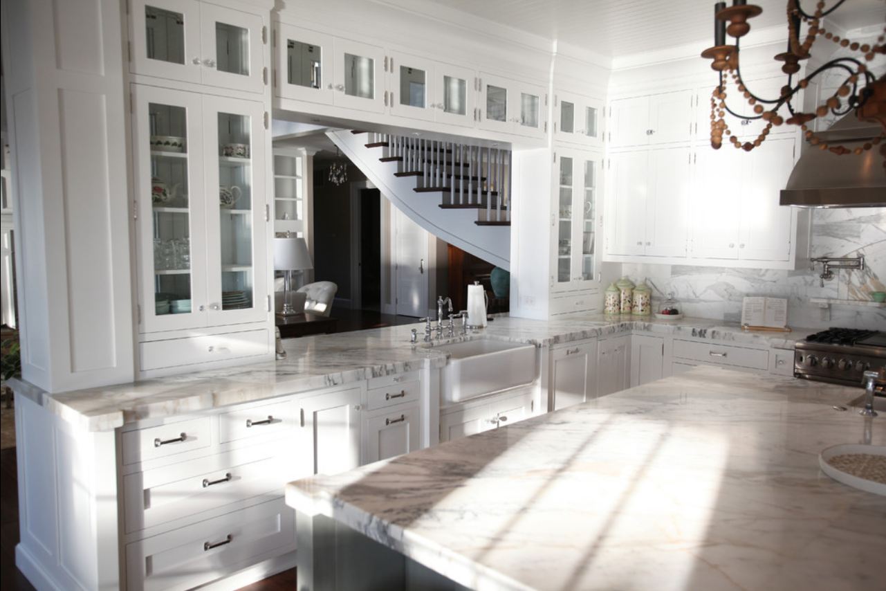
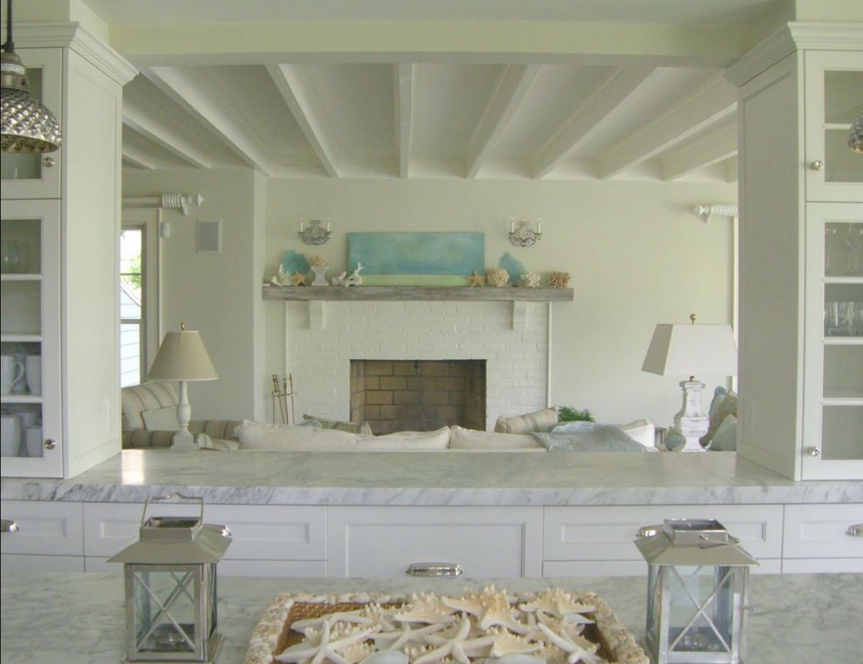
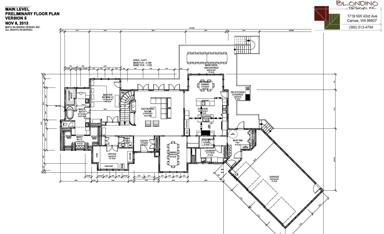
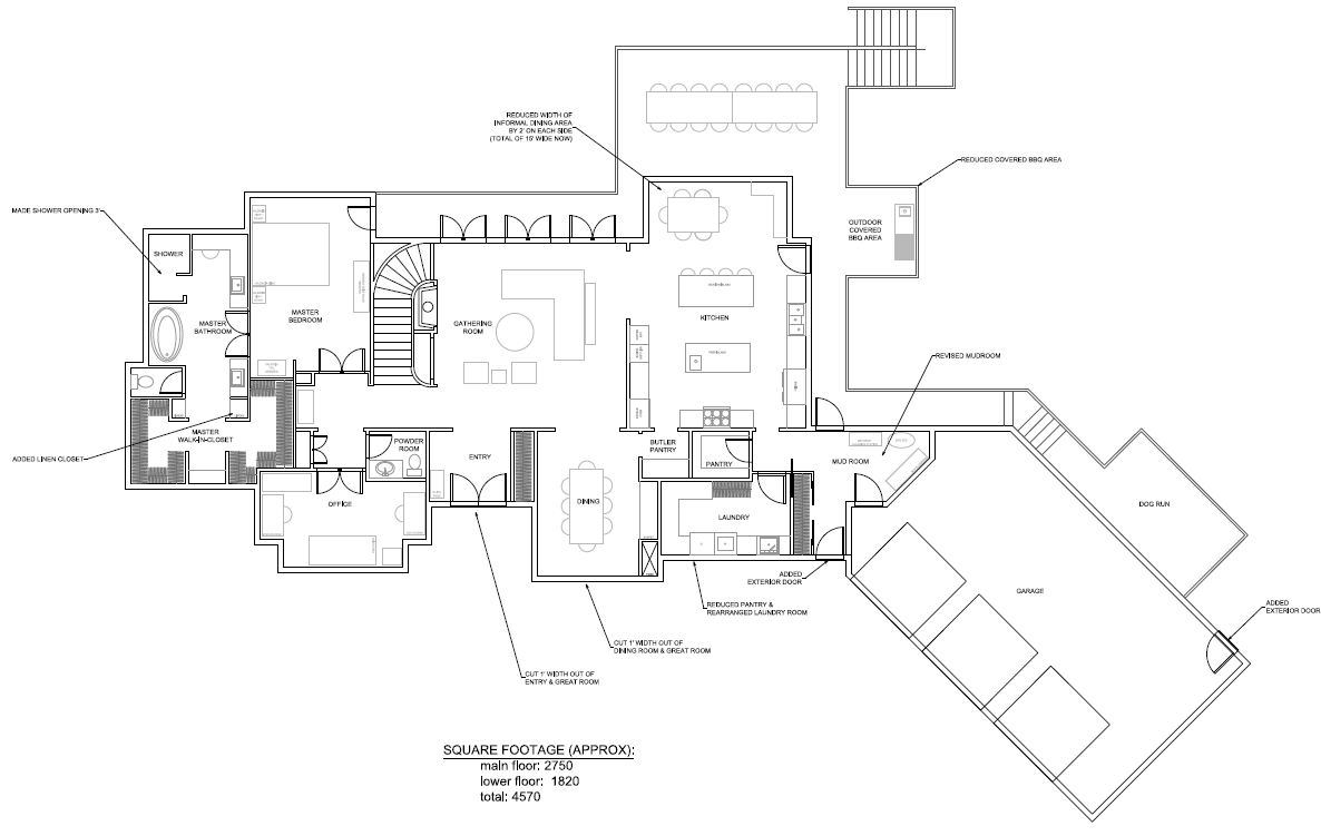
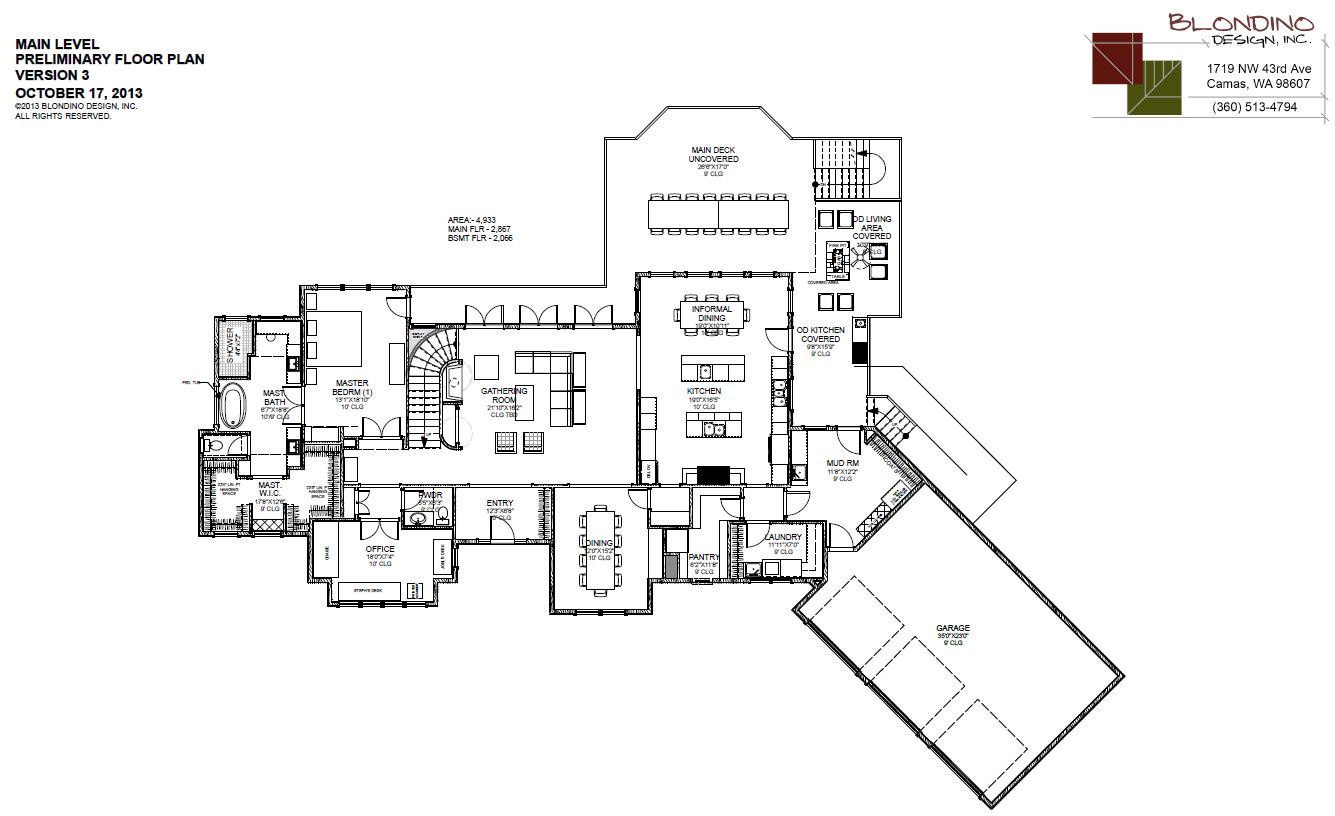
At this point we really feel good about how the house floor plan is shaping up and really it’s just details that we’re working on now.  After seeing the kitchen layout in Arizona, we decided that adding a pass through in the kitchen would be good…to really open up the space.  Mike added that into this version of the design.  I’m thinking that it’s a little small, and that we’ll likely want to increase it even more to open up the space though.  At the top of the stairs, we increased the depth of the “picture wall” in Version 6 to be a bookcase in Version 7.  That’ll give us more flexibility for a built-in or shelves (or both).  We also added in the coffered ceiling in the dining room – love that!  There’s really not much else that changed on the first floor, except for the swing of the laundry back door.

Preliminary Design - Version 7 - Main Floor

Preliminary Design – Version 7 – Main Floor

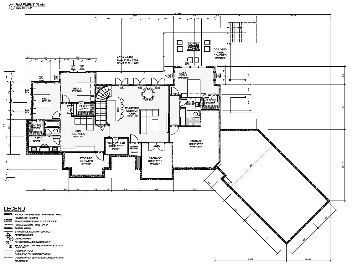
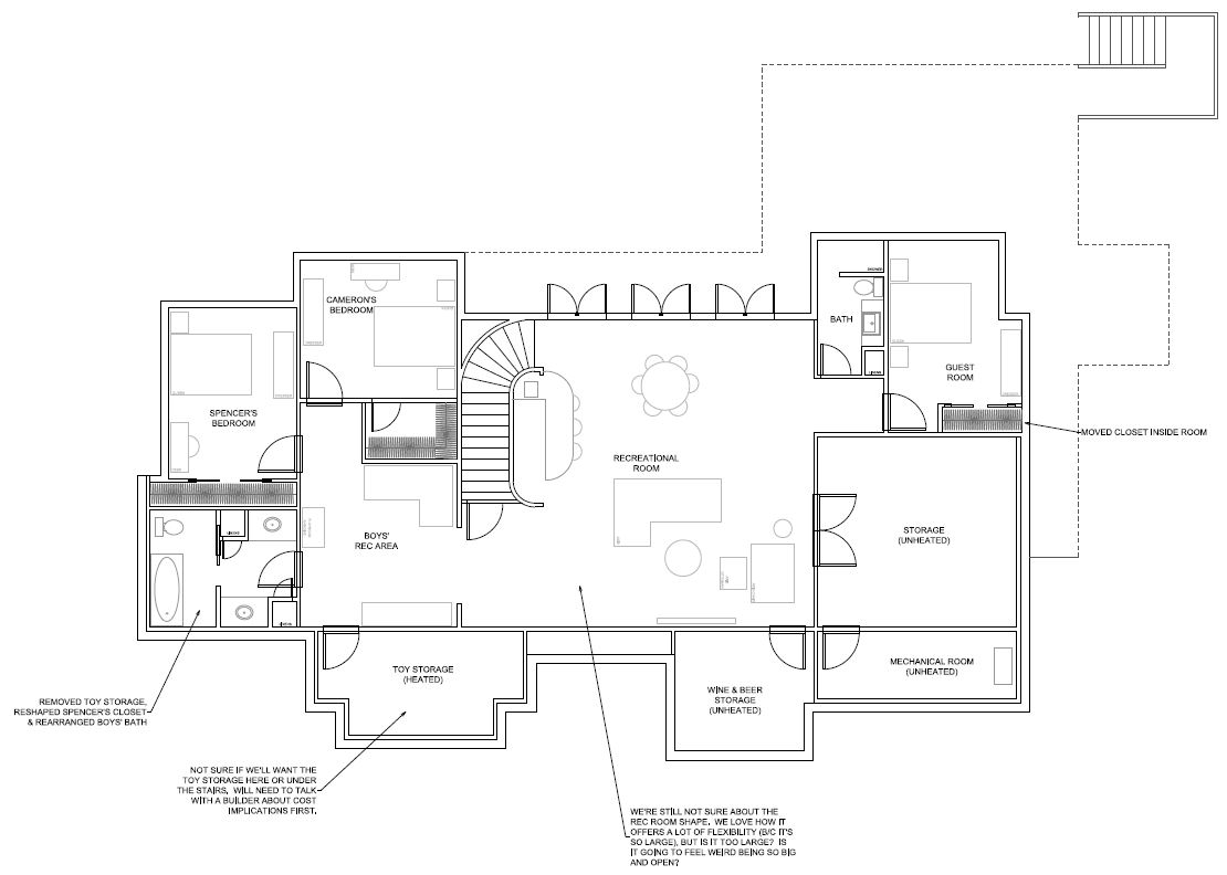
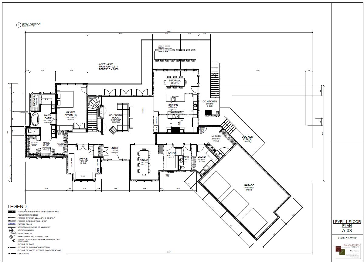
The downstairs space is really turning out great now.  We’re loving the layout that Mike came up with and really there’s only minor tweaks on this floor too.  We decided to switch Bedroom 2’s closet location with the shower/toilet room.  This will give more privacy to the bathroom and depending on how the site is graded, we may be able to add a window in there as well.  We actually debated a lot about the shower vs. tub in the boy’s bath and ultimately landed on a walk-in shower.  Really the boys only take showers as it is now and every blue moon take a bath in our soaker tub.  So we figured that they can use our tub in the new house too.  So we removed their bathtub and gave them a shower.  All of the bathrooms in the house have showers without doors.  We’re thinking that’ll be pretty nice not to have to clean any shower glass.  In the guest bath downstairs, we took half of the closet from the hallway and flipped it to be in the bathroom.  That creates a decent sized linen closet in there for guests and toiletries.

Preliminary Design - Version 7 - Lower Floor

Preliminary Design – Version 7 – Lower Floor

The outside of the house is where we’re now focusing our attention.  To us, it’s been difficult to really figure out what we want this house to look like.  In the northwest, the majority of homes are two stories from the front of the house…so having a one story is different than I ever envisioned my dream home.  Mike gave us a couple of different options in Version 6 to look at and now with Version 7 gave us yet another one.  I do like how some of the gables in the front of the house overlap, however it feels off-balance to me.

Preliminary Design - Version 7 - Exterior

Preliminary Design – Version 7 – Exterior

Arizona Kitchen & Great Room Tour

I just got back from an extended weekend trip to Arizona to visit one of my best friends for her birthday. Her and her husband recently purchased a brand new home in a beautiful gated development in Phoenix. Needless to say, we discussed custom house designs/building a lot on our trip.

After showing her our current design (Version 6), she immediately thought of a different house floor plan that is available to buy in her own neighborhood because of the kitchen. If you’ve been following this blog at all you’ll know that the kitchen nook area has been a big question mark for us. My friend mentioned that this floor plan is actually featured as one of the model homes. We were out her door and to the model as soon as possible! I absolutely wanted to check it out.

Here’s the floor plan, and as you can see, that the kitchen has double islands and the informal dining area in the kitchen is almost the same size as what we’re proposing for our house. With nearly the same layout.

Floor plan of the main floor of the model home

Floor plan of the main floor of the model home

The model home actually has a wrap around couch in the informal dining area to create a nook feel. In addition, the interior decorator realized that the space is pretty large as well, and they actually put two tables in the space. To me, it feels a bit awkward to have two tables in one nook. As we were sitting in it, discussing the space it gave off a restaurant vibe.

We agreed though that a rectangular table will definitely work in the space, even if it didn’t have a banquette. So, this gives me some options and flexibility with the room. Maybe we’ll end up starting with a table and chairs and build a banquette later if we’d like. One thing that was interesting is that this home added 2 feet of walls on each side of the seating area to create an “alcove-like” feel to the informal dining space. That’s a great idea and it did define the space well.

Model home kitchen with double islands and informal eating area

Model home kitchen with double islands and informal eating area

Model home's informal eating area with 2 tables and a wrap-around couch

Model home’s informal eating area with 2 tables and a wrap-around couch

This kitchen / great room layout is extremely similar to ours with the great room being adjacent to the kitchen. The biggest difference is that our current plan has another run of cabinets between the islands and the great room and although we’ll have a large opening into the kitchen, there will be a fairly significant wall dividing the two rooms. Below is a picture of the model home and of what our house would look like of we removed the wall between the great room and the kitchen. It’s pretty open, and our house has slightly larger rooms than the ones shown below. But is it too open? It is great for entertaining, that’s for sure.

Model home's great room view into the kitchen.

Model home’s great room view into the kitchen.

Now I’m beginning to think that our own design might be too separated. It was nice to have the space open to each other, however I’m certain that Joel and I would think that it feels too open. I’ve got to discuss it with Joel, but I’m beginning to think that maybe we want to still keep the large cased doorway opening between the two rooms, but add a pass through window onto the dividing wall. This would be something similar to the examples below.

Pass through into great room adjancent to another door opening.

Pass through into great room adjancent to another door opening.

Pass through idea in kitchen.

Pass through idea in kitchen.

(via)

Preliminary Design V.6

Or latest design revision has really been both fine toothing some areas while others are still figuring out their layout. In the upstairs, minor tweaks have been done. This includes the addition of a picture wall inset at the wall opposite the top of the stairs. The office also changed with the extension of the master closet and the office closet, and the addition of a window seat on the north wall. I’m not 100% sure we’re done with changes in the office though. I’m starting to think that maybe the addition of built-in bookcases might be nice since we don’t have those anywhere in the house yet. The HVAC ductwork also moved near the entry which created more useable space for the laundry room…LOVE that!

Preliminary Design V6 - Main Level

Preliminary Design V6 – Main Level

The lower level was rearranged a little bit as well…trying to find the best layout downstairs has been a bit tricky. The boys’ bath was reconfigured to both reduce the bathroom size (since bathrooms are pricey) and create a walk-in closet in Bedroom 2. That’ll be nice for both boys to each have a walk-in closet for sure. Bedroom 3’s closet was actually reduced slightly to create a hall linen closet. That was much needed and will likely hold everything from blankets and sheets to towels and washcloths. Who knows, maybe a few games or puzzles too!

The hallway for the guest room area was also flipped so that the entrance is to the stairs for better flow. The closet in the guest room was also rearranged to allow for windows to be placed on three walls. Since the guest room is located under the main deck, having ample light in that room is important to us. A hall linen storage closet was also added by the guest room.

Preliminary Design V6 - Lower Level

Preliminary Design V6 – Lower Level

Mike also gave us another iteration of the exterior of the house with this round of edits. The exterior combines some of the features we liked about his first sketch with others that we liked about his second. As shown below, the roof line is swept and gabled roof lines have been added to the front of the house. Windows have been added above the front door to create a focal point. Mike added two versions for this – one with a gabled roof as shown in the top and bottom perspective views and one with a shed dormer as shown in the middle true elevation view. I’m really not sure what to do about that or which I like better, and I keep thinking about the previous version without windows above the entry with the overlapping gables between the entry and the dining room. All of the designs work, but honesty, none feel perfect right now. I think that we’re going to need to work with Mike and discuss the options more to really come to a good conclusion.

Preliminary Design V6 - Front Elevation

Preliminary Design V6 – Front Elevation

Preliminary Design V.5

We’re so excited. Just two days after our last revision we received the latest plan set from Mike. He was working of the exterior of the home and I wanted to make sure that some of the changes I wanted were incorporated before he got too far on the exterior. That meant sending a quick email to him with a list of changes.

Take a look! By rearranging the guest room and bathroom downstairs we were able to bump in the kitchen in the informal dining space on the main floor by 2 feet instead of just 1 foot. He also rearranged the mudroom and its finally to a size that we love. It will have built in lockers for the boys and a coat closet for us which will not only hold the large array of coats that we have because we live in the northwest, but be a place to store the vacuum and other cleaning supplies as well.

Preliminary Design V5 - Main Level

Preliminary Design V5 – Main Level

He also shrunk down the great room downstairs which feels so much more appropriate. He did that by increasing the storage on the back wall and by creating a hallway to get to the guest suite. An extra bonus is that by bringing in the back wall, there is now a true “entrance” to what we call the boys’ area. They’ll have a great play/art area and then off of that their bathroom and bedrooms. Also in this round of edits you’ll see that we increased the size of the boys’s bathroom. It now includes a bathtub and a shower. I really like this idea, but since bathrooms are pricey and because Bedroom 2 doesn’t have a walk-in closet, we want to see a different layout for the next round of revisions. We’ve left that design completely up to Mike to create. He’s also thinking that we should have a linen closet outside of the boys’ rooms as well.

Also downstairs, we’ve moved the outdoor living area underneath the main deck. That will create a covered area for hanging out during the summer and keep the main deck for dining. Summer evenings on the property should be pretty shaded due to large evergreens that line the south side of the property so having a covered lounge spec isn’t the highest priority for us. Upstairs we really only want a covered area for barbecuing in the rain.

Preliminary Design V5 - Lower Level

Preliminary Design V5 – Lower Level

Mike also sent over a preliminary sketch so that we could see what the outside of the house is now looking like since there’s been significant changes since our first preliminary design. This is only the second time that we’ve seen the outside revision so it’s fun to see how it’s taking shape. The design is pretty rough though and it’s hard to really see what’s going on. The main change is the double gable over the entry/dining room.

Preliminary Design V5 - Front Elevation

Preliminary Design V5 – Front Elevation

Preliminary Design V.4

Mike incorporated mostly all of the edits that we had given him and the house is really taking shape. The mudroom reduced significantly in size, although still feels too large and open. However, he was able to add in a door from the front of the house, something I love and think will get a lot of use. The laundry room was expanded by reducing the size of the pantry. The pantry size is now much smaller. Our thoughts were that we really have a lot of cabinetry in the kitchen, so we really will only store food items in the pantry. This is more than enough space to do that. I’m not sure if you noticed, but the previous pantry design had a fridge in there. I love that idea, and it would be so handy, but realistically, I’d rather use the space for a laundry room and put an extra fridge in the garage. The garage is so close to the kitchen anyhow that I doubt it will be a huge issue for us.

The informal dining area in the kitchen was only bumped in a foot on each side. At originally 19 feet wide, this space was too large for our main family eating area. I wanted the room to be bumped in 2 feet on each side which would reduce the width to 15 feet. However, if we did bump it on by 2 feet there wouldn’t be enough room downstairs in the guest room to move around the bed. So, we were only able to bump it in one foot, bummer!

Preliminary Design V4 - Main Level

Preliminary Design V4 – Main Level

The downstairs didn’t change too much, besides getting resized due to the rooms on the main floor changing in size. The great room still feels too big and we’re not really sure what to do about that. Mike felt the boys bathroom was large enough for the boys. I’m still disagreeing abut that and want to see it expand in size. The downstairs feels so large and to have such a small bathroom feels like a mistake. I’m betting that both boys are going to be over 6 feet tall in high school and since we don’t plan on moving I definitely don’t want it to be cramped in there. We’ll need to see some other ideas that he has to increase that space.

Preliminary Design V4 - Lower Level

Preliminary Design V4 – Lower Level

Preliminary Design V.3 Markups

Today I spent most of the day at my parents’ house where my mom and I spent a long time checking out the plans and making some changes.  They still live in the house I grew up in which is 3,200+ square feet.  Since it’s difficult to imagine the sizes of the rooms in our plans, we took the dimensions of our house plan and measured them against my parents’ home.  This really gave me a great feeling if each of the rooms were big enough or too small.

As we’d measure out each room we’d also make changes in CAD to the size/shape as well. This really didn’t affect too many of the rooms, but we did cut a foot out of the dining room.  I’m still not sure if this is the right thing, but I’m pretty sure that an 11’ wide dining room will be enough space.  I’ll measure a few other people’s dining rooms before settling on that I’m sure.  What I like about taking out a foot from the dining room is that it also takes a foot out of the great room and in return a foot out of the downstairs.  That really does save some space in two areas that are likely larger than need be.  We also took a foot out of the entryway – but that might end up being too tight…we’ll see what Mike says.

We also rearranged the laundry and mudroom area.  The mudroom seemed too big, so we’ve made it more of a hallway and added a door to the front.  That’ll be nice for friends & family to use when they come in.  Plus, as the boys get home from school it will be nice for them to get into the house using that door instead of either opening up the garage door or going through the front.  I really like that change!  The pantry shrunk quite a bit in size since the last version.  Although I would LOVE to have a huge pantry with an extra fridge as Mike had shown, I’d rather have that space in the laundry room.  I figure that we can put an extra fridge in the garage, which really isn’t too far away from the kitchen anyhow.  And for an infrequent as we’ll use it, I’m sure that will be just fine.

One of the other things we did is bump in the informal dining area in the kitchen by 2’ on each side.  This is something that Mike had suggested, so I definitely can’t take that credit.  I had mentioned how I thought it was pretty big and he said that if we bumped the walls in to the width of the counter on each side your eye won’t even know that you did it.  And actually, my parent’s kitchen/eating area is the exact same way.  And he’s right…neither my mom nor I had ever noticed that!

We shrunk down the space outdoors for the covered BBQ area.  Mike feels strongly that we need a great outdoor entertaining space, especially covered given the weather in the Pacific Northwest.  The feeling of, “if you build it, they will come” for the outdoors.  And I do agree with him; however, I still made the space smaller – and just for the bbq area.  I figure that the deck off of the main level will create a great covered area downstairs.  We still haven’t settled on anything so I’m sure that will be a discussion we’ll get more into later.

Preliminary Design V3 Markup - Main Floor

Preliminary Design V3 Markup – Main Floor

For the downstairs, I felt that the boys’ bathroom was sort of tight and with Joel being 6’2” and both of the boys in the 90% percentile for height, I thought they may need more room.  In doing so, the toy storage closet downstairs was moved and I’m not sure how I feel about that.  We’ll need to see the cost implications of what we’re proposing.  Definitely need to talk with a builder about that one.

I didn’t make any edits to the downstairs great room – it’s really big, and maybe too spacious.  Do you know how when you’re in too big of a room that it doesn’t feel comfortable?  We really want the downstairs great room to feel casual and comfortable.  We’re really not sure what to do about that though.  It’s difficult because the shape of the downstairs is really dependent on the shape/space of the upstairs.  And we really are really loving the upstairs!

Preliminary Design V3 Markup - Lower Level

Preliminary Design V3 Markup – Lower Level

Preliminary Design V.3

Mike was able to quickly turn around our comments on version 2 in just 2 days!  Although we’re in no hurry to get the design done, I always love seeing the changes from Mike in an updated design.

Mike was able to remove the hallway near the kitchen which cuts down on square footage.  That made us gain a butler’s pantry so access to the dining room from the kitchen is easy and convenient.  It also pushed the pantry closer to the kitchen which is perfect.  Working with Mike is great because he’s able to take my ideas and improve them.  For example, I originally had drawn the pantry to be accessed from the butler’s pantry.  But it definitely makes more sense how Mike drew it.  The door to the pantry is closer to the garage so we’re able to take groceries straight from our car and into the pantry if needed.

He also moved the powder room over by the office and rearranged the office shape to create less wasted space in there.  When I first saw the placement of the powder room I wasn’t sure if I liked the door to be “around the corner” in the little alcove to the office instead of off of the main hallway.  But the more I look at it, the more I love it.  The door is hidden and as people walk up the stairs from the lower level they’re not staring into the bathroom.  I’m able to hang some art or family pictures on the wall instead.  Definitely a huge improvement!  Mike has such great ideas.  It’s surprising how little changes like the orientation of a door can really make a home feel either perfect or awkward.  Take a look at the changes below.


Preliminary Design - V3 Main Floor

Preliminary Design – V3 Main Floor

The basement has a lot more detail than it did last time too.  The boys’ recreation area was added near their bedrooms along with a closet for toy storage – we can always use that!  And the guest room was reoriented so that the bathroom was outside of it.  Perfect!  Mike also added an unheated space for beer & wine.  Joel is really getting into different types of microbrews, so having a space to store them in a cool temperature is definitely someting that he wanted downstairs.  This also should be pretty inexpensive since the only real cost to us will be the addition of a door and maybe some electrical for lighting and/or an outlet or two in there.  Nothing fancy for sure.

Preliminary Design - V3 Lower Level

Preliminary Design – V3 Lower Level

Preliminary Design V.2 Markups

Based on all of the edits, I discussed in my previous post, I sketched up the main and lower floor plans to send to Mike.  I’m really not sure how most people send edits back to Mike, but I thought this was the best way since I wanted to shift rooms around.

I removed the hallway between the kitchen and the dining room and created a butler’s pantry, which also moved the kitchen pantry closer to the kitchen which I like.  The mudroom and laundry room still need some work – the mudroom seems big, but that’s for Mike to figure out.  We thought that by removing the hallway that the old location of the powder room was too close to the kitchen (nothing worse than that), so I moved it over by the office.  This change affected the master closet so that will have to be finessed into the best space.

V2 Sketch- Main Floor

V2 Sketch- Main Floor

Downstairs I shrunk down the size of the boys’ bedrooms to create a little play area outside of their rooms.  That way their toys are spilling all over the downstairs.  I really wanted our guests to be able to use the bathroom that the guest room uses, so pulled the bathroom out of the guest room and created a little hallway.  That way, when guests are there, they feel that the bathroom is theirs, but ultimately it’s accessible for everyone.  Finally, I changed some of the downstairs into unfinished storage area to use up some of the space down there.

V2 Sketch- Lower Level

V2 Sketch- Lower Level

Preliminary Design V.2

Today we received the latest design from Mike Blondino, and the house is really starting to take shape.  We wanted to focus on the floorplan before we start editing the exterior since the outside is really built upon what the floorplan is shaped like.  In addition, the main floor really drives what the downstairs is like.  So you’ll see that there is a lot more detail and thought put into the upstairs and a lot less in the downstairs.

He took into consideration all of the edits that we had and this is what he came up with.

Preliminary Design V2 - Main Floor

Preliminary Design V2 – Main Floor

We absolutely love the kitchen!  It’s really starting to become the space that we want.  Extra large for cooking and family gatherings since everyone always seems to end up in the kitchen, a prep island and an island for serving and barstools.  The informal dining room seems pretty large to me.  Right now it’s bigger than the dining room.  We also think that the pantry is too far from the kitchen.  We use our pantry a lot to store all of our food, so to have it separated by a hallway seems too far away.

The dining room placement is perfect though.  Near the kitchen and the table is able to extend into the great room when needed.  The bump out is nice for a vintage buffet or built-in too.

Mike gave us an outdoor kitchen area which is something that we hadn’t thought about, but absolutely love.  And the backdoor from the mud room is perfect for the dogs accessing the dog run area during the day.  I’m not sure if I mentioned before, but the mud room will serve double duty – a place to drop shoes and backpacks and also a place for the dogs to stay inside during the day with access to the outside for them to do their business during the day.

Preliminary Design V2 - Lower Level

Preliminary Design V2 – Lower Level

The downstairs seems pretty big and open – the lighter gray area is what’s included in the square footage calc.  Oh yes – the square footage…much too big right now.  We’ll have to keep working on trimming that down for sure.  Back to the basement though.  The main thing I don’t like is that visitors downstairs would need to use the boys’ bathroom or cut through the guest room to get to that one.  I would rather have people use the guest room bathroom since it won’t be in use very often.  And I’d like to have the same doors to the backyard downstairs that we’re having upstairs for consistency.  This is definitely a space that will need more thought as we’re getting pretty close to figuring out the upstairs.

AIA Home Design 101 Class

Last night, Joel and I attended a two hour class presented by the AIA Seattle Custom Residential Architects Network entitled “Home Design 101” and the course description was as follows:

“Dreaming about a project and not sure where to start? Trying to figure out how to make the most of your budget? Curious about green design or how to plan for your family’s changing needs?

Whether your project is a small remodel or new construction — or if you are just curious about the design process — AIA architects can help. Join us for an information-packed seminar on an overview of the design and construction process including budget advice, tips for hiring the right contractor, what to expect, and how you and your designer can work together to make the most of any project. This will be an   interactive workshop so be sure to bring your “napkin sketch!”

It sounds great, right?  I thought so too.  I signed up for the class immediately when I saw the email.  Boy was I wrong!  This class was the BIGGEST waste of time!  It felt like we were sitting there for two hours while two architects gabbed about how great they were at everything and why you should hire them to be your Architect.  I of course love home design so I sat through the entire presentation with ease, Joel on the other hand wanted to get out of there as soon as it began.  He said that it reminded him of what he thought a timeshare presentation must feel like.

The gist of the presentation went through the design process which includes the following steps:

1. Pre Design/Programming

2. Schematic Design

3. Design Development

4. Construction Documents

5. Bidding & Negotiations

6. Construction Administration

Granted, it’s good to learn about those steps, but when each step is basically the two presenting architects discussing why they are so great at each step and how they’re fabulous at everything it really doesn’t give you much detail about the design process.  Even worse, when I asked a couple of questions they completely skirted around the answer.

Needless to say that is the last time we’ll be attending a presentation put on by AIA Seattle!

The only good thing that we got out of the presentation is realizing that we’re so extremely lucky to have found Mike Blondino and to be working with him.  I can’t imagine working with an arrogant, conceited architect like the two that we spoke to last night.  It’s amazing to me that people hire them to design their homes.  I’m sure glad that we didn’t!

If you are interested in learning more about the design process, there are fantastic books and websites available.  One of my favorite books is “Designing Your Perfect House: Lessons from an Architect” by William J. Hirsch Jr AIA.  It covers the entire design process and gives great tips and ideas for designing a home.  I would highly recommend reading that book instead of attending a seminar like we did.